Back to all work
Case study · 01

Many products, one system.

The company had more than four different products under one brand, grown, and some acquired, separately. They looked, and even sounded, like they came from different companies. This is how we pulled them into one cohesive product, and how the design team got built along the way. It's one of several design systems I've built, and the one I can walk through end to end.

Company
Perceptyx
Role
Senior Product Designer
Type
Design System · Employee Experience
4+ → 1
More than four different products under one brand, brought into one cohesive environment.
0 → 5
Designers on the team in six months. I joined early and helped set it up.
~40%
Less design QA, once we had a shared system to check quality against.

Chapter 01 · Products that felt like different companies

More than four different products under one brand, with no shared identity, personality, or voice between them.

When I joined the company, the platform was really more than four different products that had grown up separately. Many were built in-house, others arrived through different acquisitions. Each had its own visual identity, its own colors, its own elements, even its own personality and tone of voice. Side by side, they didn't feel like one brand, or even like the same company.

There wasn't a single source of truth.
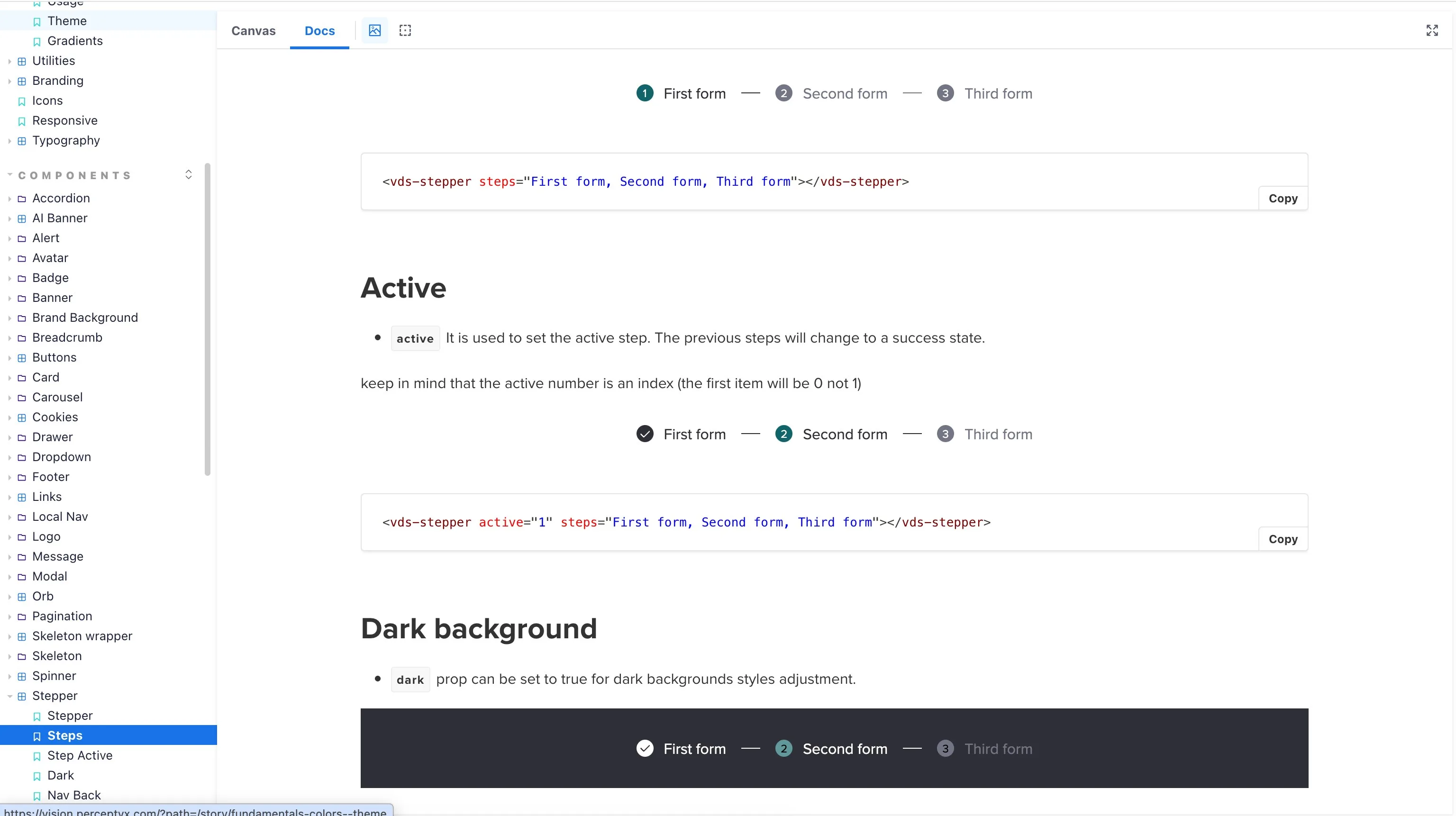
A component documented in Storybook: the stepper with its states and code snippet.
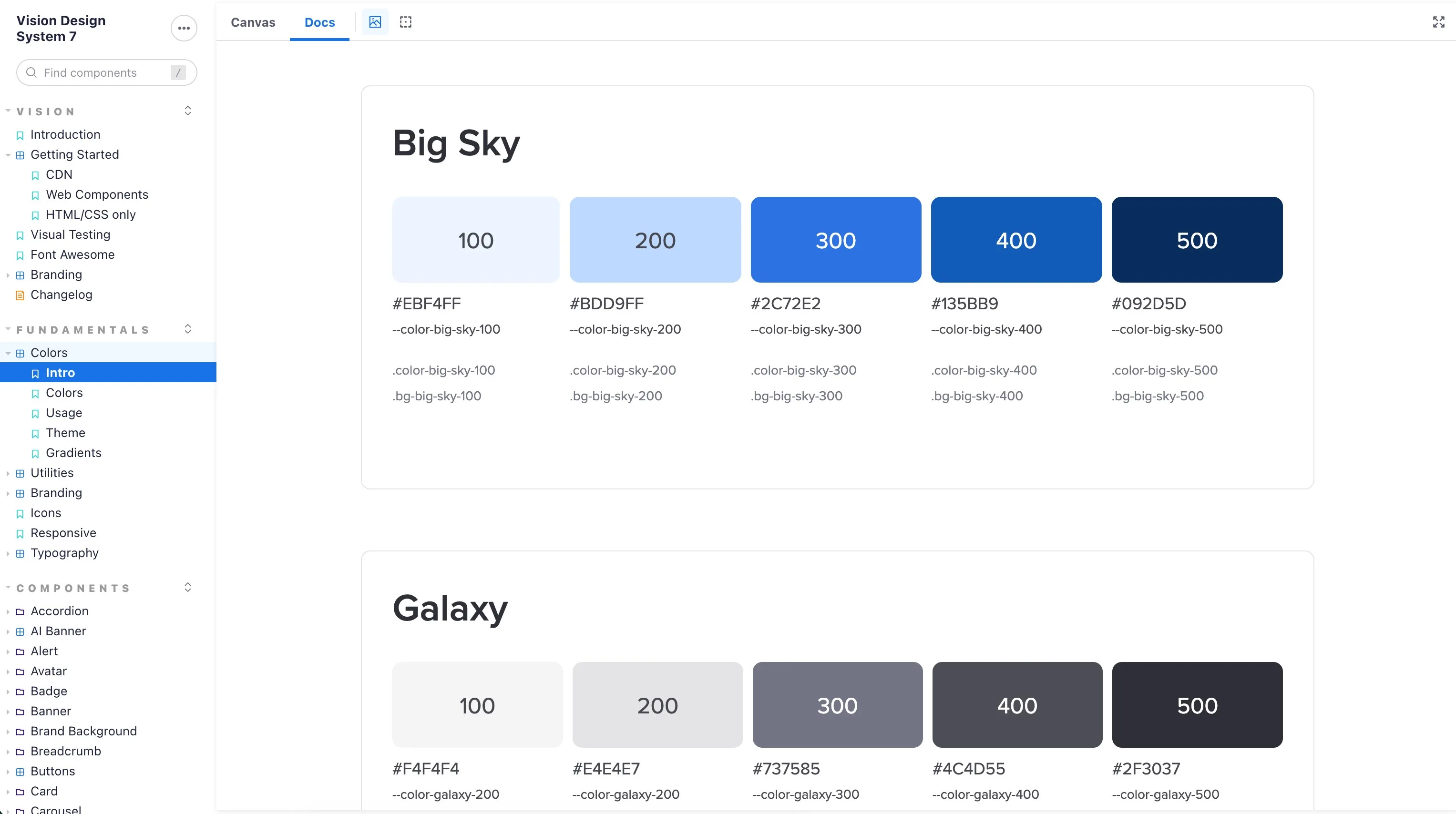
The color scales documented in Storybook, with hex values and token names.
FIG. 1 The design system, documented in Storybook, components and color scales, design and code alike.
Chapter 02 · No design step, no shared components

No shared components, and no research or design step in between all the teams.

The company had been around for more than twenty years, and for most of that time features went straight from an idea to code. There was no design practice yet, and no shared frontend across the products. Each one had its own interface and its own way of doing the same things.

That fell hardest on engineering. Without shared components, teams rebuilt the same things over and over. And because the work didn't pass through research or design first, the products grew around what was easy to build rather than what users were trying to do. Customers mostly learned the tools through repetition and demos, and the learning curve was steeper than it needed to be.

Chapter 03 · Foundation first, not screen by screen

Together with the head of design, we decided to treat the product as one thing and build the shared foundation first.

When the design team came together, the head of design and I landed on the same approach: instead of redesigning screens one at a time, we'd start with a shared foundation and let the products grow from there. It was the only way to get products that looked like different companies to feel like one.

Coming from the frontend side helped me here. I could work closely with engineering, speak their language, and think about how each decision would actually be built, not just how it would look in a file.

Chapter 04 · Tokens, then components, accessibility built in

We started with the basics: tokens, not screens.

We started with an audit of what each product was already using, just to see how much was there. There were far more values than anyone expected, so we collapsed them into one small, shared set of tokens. From there we moved up to the more complex components, designed once together with engineering, with accessibility built in from the start: contrast, focus states, and keyboard behaviour.

The core idea was that the system had to be agnostic. Each product had its own codebase and its own constraints, so any team had to be able to adopt it without rebuilding everything from scratch. Alongside that, we kept a React version of the shared components for new areas that were being built from zero.

It all lived in Storybook (after we designed it in Figma), documented for both sides, how to use each component in design and how to build it in code. The dynamic brand color was a good example: each customer picks their own brand color, so the system generates the five shades from it and adjusts them to keep contrast accessible, whatever they choose.

I owned the visual side from the start, working closely with engineering so it would hold up in code. It began as my work and grew into a shared library, the base for every new product the company built after.

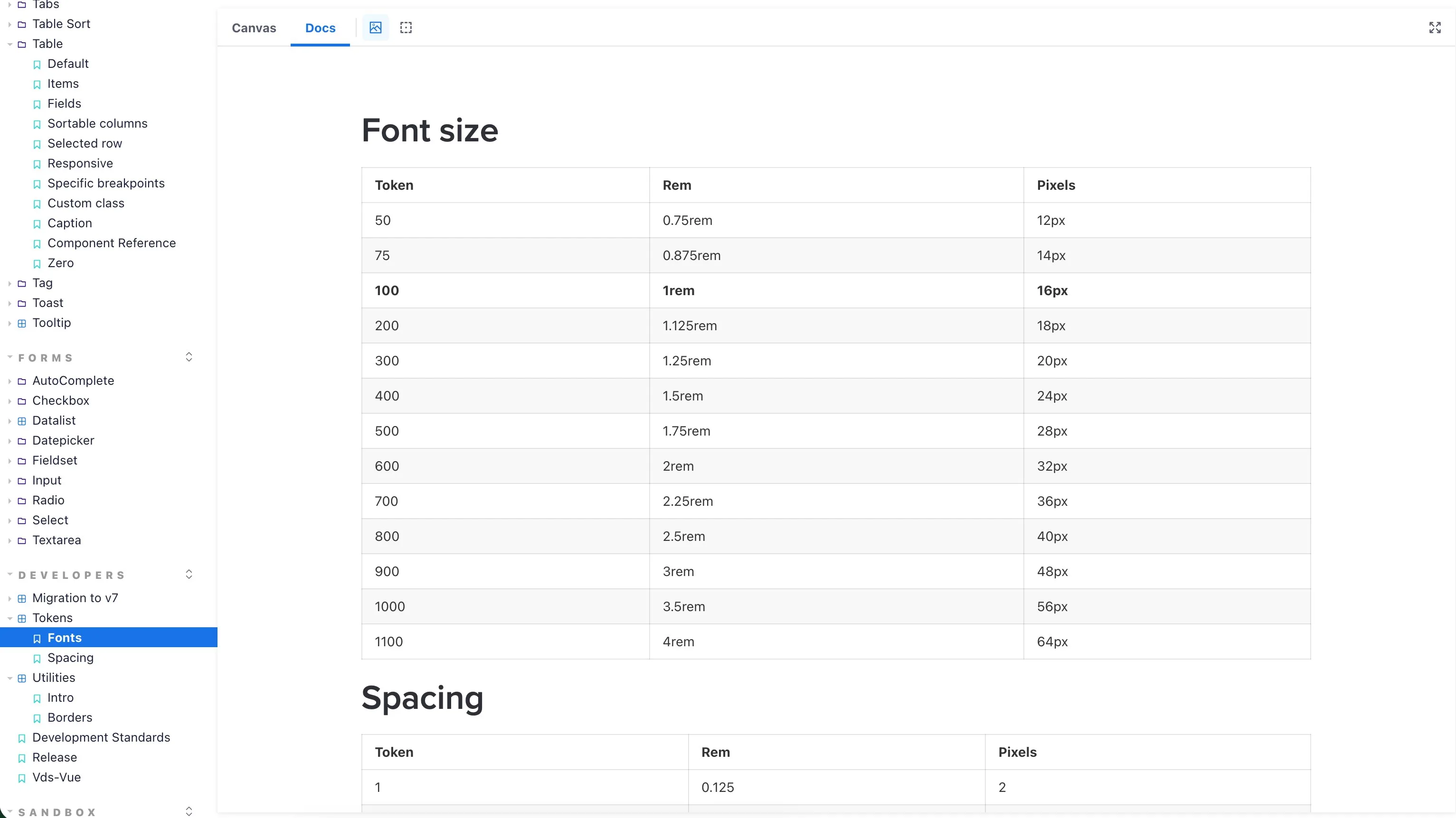
The token foundation in Storybook: font-size and spacing scales as documented tokens with rem and pixel values.
FIG. 2 The token foundation, type and spacing scales, documented.

Chapter 05 · One brand, a team, less QA

A design system is less about components and more about helping people agree.

After a few months, features built on the system looked more consistent, and the products started to feel like one brand instead of several. Design QA turnaround dropped by roughly 40%, and there were fewer debates about small visual details.

It also changed how the product worked as a whole. Separate tools, each with its own login, came together into one platform behind a single login. Moving between sections got easier, everyday tasks got simpler, and a set of legacy tools became one coherent environment.

The bigger change was on the team. We went from no dedicated designers to five in about six months.

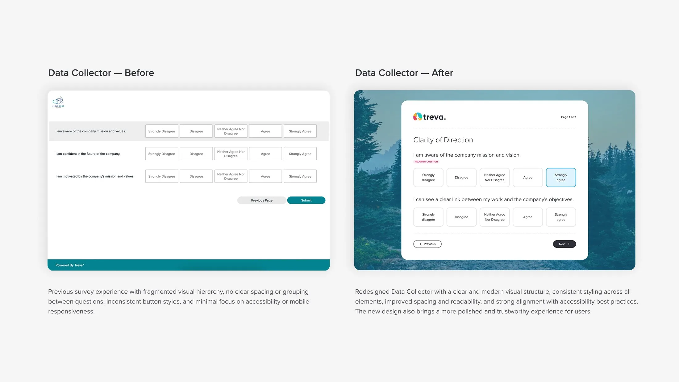
The same survey screen before and after the design system: from fragmented spacing and inconsistent buttons to a clear, consistent, accessible layout.
FIG. 3 The same survey screen, before and after the system: fragmented spacing and inconsistent buttons become one clear, accessible layout.
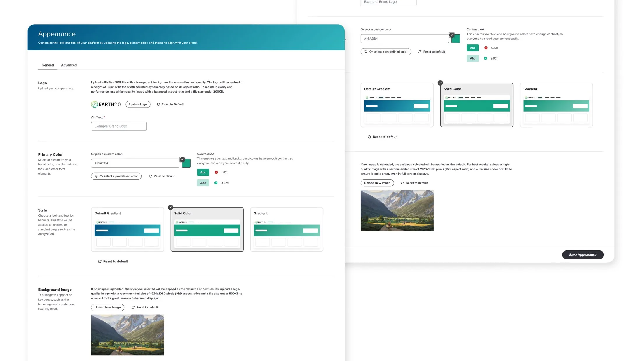
The platform's Appearance settings: a customer picks their brand color and the system checks contrast in real time, showing which text and background pairs pass accessibility.
FIG. 4 Customers set their own brand color, and the system keeps contrast accessible.
FIG. 5 The brand color in action, change the color and the shades rebalance to stay accessible.

Chapter 06 · A system people actually reach for

The point wasn't the components. It was making the next person's job easier.

What I took from this project is that the hardest part of a design system isn't drawing it, it's getting people to reach for it instead of rebuilding their own version.

My frontend background helped more than I expected. I had a rough sense of how engineers think about reuse, naming, and edge cases, so I tried to design the system to fit how it would actually be built. That made it more likely to get used.

Four-plus products into one system, a design team from zero to five, and about 40% less design QA. If you're scaling a product and want it to hold together, let's talk.

More work
UX Research — from guesses to evidence: personas, the home dashboard and a to-do list that shipped Turni — a platform to manage classes and students, shown on desktop and mobile Neto — finance tools for freelancers: the summary screen with net balance per currency