Back to all work
Case study · 02

From guesses to evidence.

The company was dev-first; features usually went straight to code. The homepage that tied all the products together had been built that way too, on assumptions, and it wasn't working the way users expected. We used its redesign to bring in real user research, and to show what that saves.

Company
Perceptyx
Role
Senior Product Designer
Type
UX Research · Discovery
~62 SP
Story points of building and reworking saved by validating the home dashboard before re-designing it.
10
User interviews run for the homepage, by two designers taking turns.
0 → habit
Research went from a non-existent step to a repeatable habit that carried over into other features.

Chapter 01 · A homepage built on guesses

The homepage tying all the products together already existed, but it had been built on guesses, not on what users actually needed.

The company had always been dev-first: most features went straight from an idea to code, with no research step in between. The homepage, a single dashboard meant to pull all the products together, had been built the same way, on what people believed would work rather than on anything we had checked with users. It was an early attempt at unifying the products, before a design system existed to do it properly. It had shipped, but it didn't work the way users expected.

It was an important screen. It was the first thing people saw and the place where all the products came together. When I joined the design team, we had to re-focus the product around what users actually needed, and the homepage was where the research started.

Chapter 02 · Designing on assumptions has a cost

Designing on assumptions feels fast. The cost shows up later, when you have built the wrong thing.

The risk wasn't that the homepage would look bad. It was that we would spend weeks building something around what we thought users needed, ship it, and only then find out we were wrong, with all the rework that comes after.

Another designer and I thought this was the moment to do it differently. Instead of arguing for research in the abstract, we would use the homepage to show what validating first actually saves.

Chapter 03 · Prove it with numbers, not opinions

Use the homepage rebuild to make the case for research, with numbers, not opinions.

The plan was simple: before committing to a design, talk to real users about what they needed from that screen, and compare the cost of validating up front against the cost of building on assumptions and reworking later.

If it worked, we wouldn't just get a better homepage. We would have a concrete example to point to the next time someone said research would slow things down.
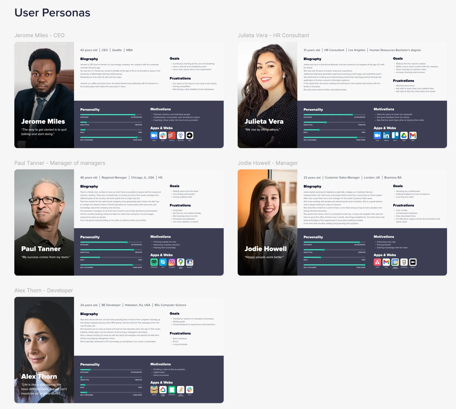
A set of user personas, CEO, HR consultant, managers, and a developer, each with goals, frustrations, and motivations.
FIG. 1 Before designing, we built a clear picture of who actually uses the product.
Chapter 04 · Ten interviews, two designers

We ran the interviews ourselves, taking turns: one asking, one observing.

We ran ten interviews for the homepage. The two of us took turns, one leading the conversation, the other observing and taking notes, so we always had a second read on what people actually meant.

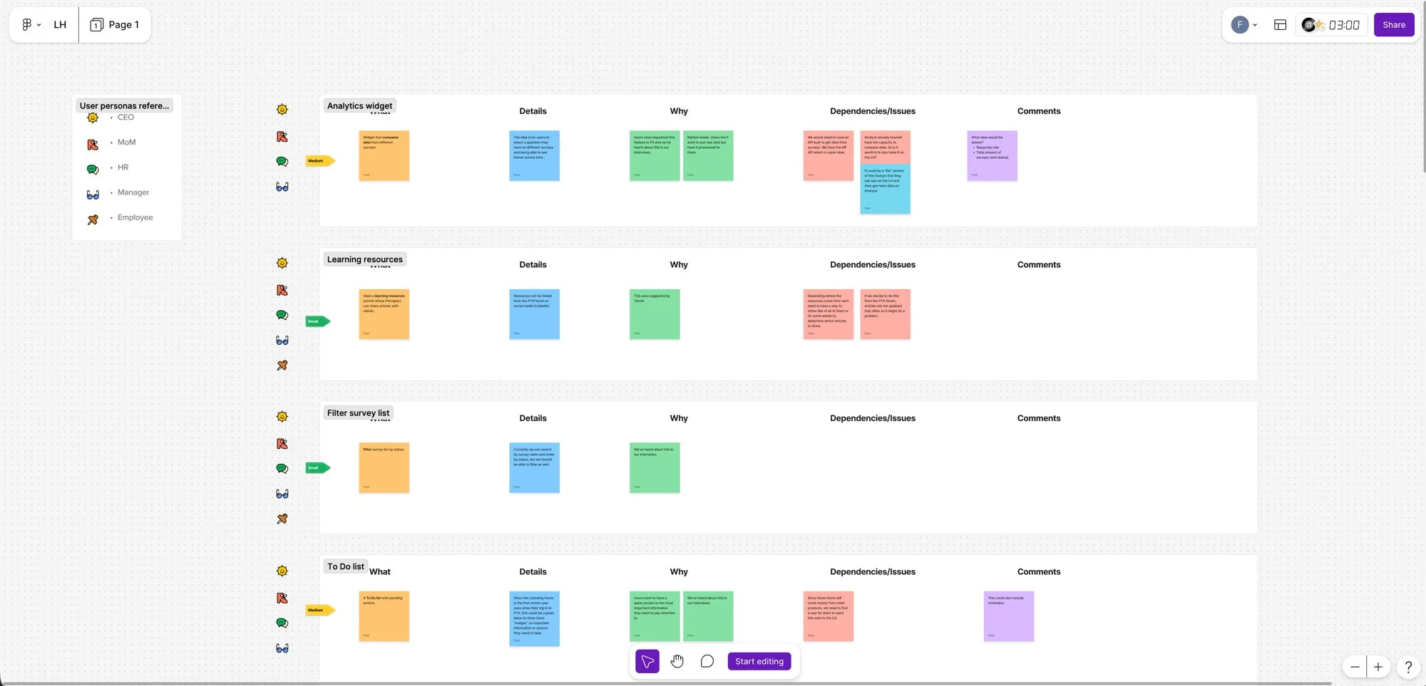
Then we put the findings into UX analysis tables: the classic approach, scoring and counting so we could see which needs carried the most weight and where the same patterns kept coming up. That turned a pile of conversations into a clear, defensible picture of what the homepage needed to do.

A synthesis board mapping interview findings into prioritized features, each with what, why, dependencies, and comments.
FIG. 2 Interviews turned into prioritized features, what, why, and what it depends on.
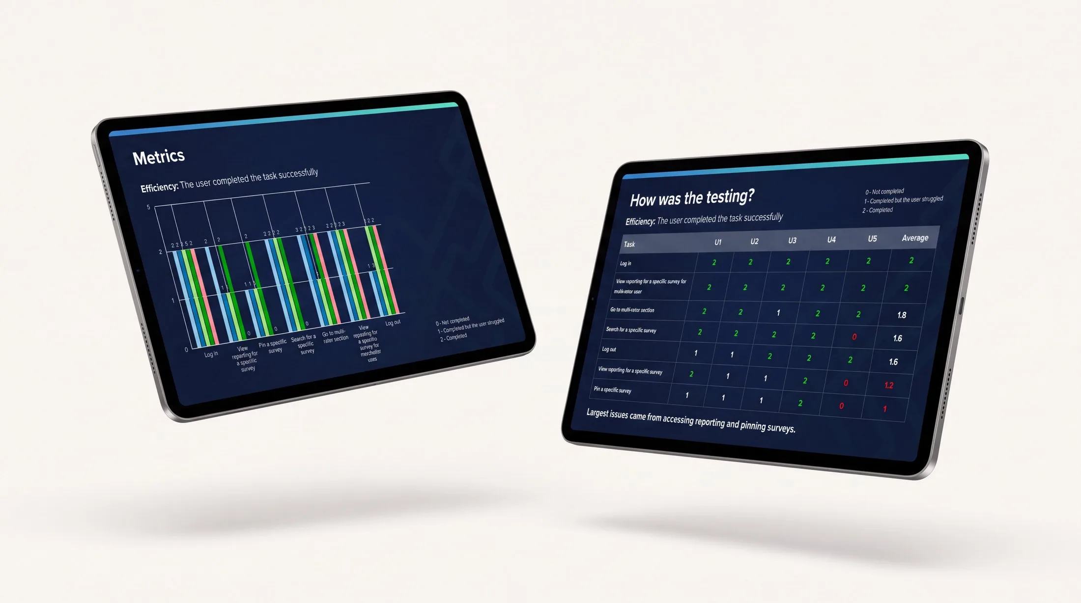
Two tablets showing usability testing results: a task-efficiency chart and a per-user scoring table flagging where people struggled.
FIG. 3 Findings scored and counted to surface the patterns that mattered most.

Chapter 05 · What validating first saved

Validating first saved an estimated 62 story points of building and reworking on that one feature.

By designing the homepage around what we had actually heard, we avoided building on the wrong assumptions. We estimated it saved around 62 story points of build-and-rework on that feature alone. It is a rough number, drawn from the research itself: the panels and flows we would have shipped on the wrong assumptions and then had to redo. The home dashboard shipped closer to what users needed the first time.

After that, research started showing up in other features too. It wasn't universal, some project managers leaned on it more than others, but enough of the team adopted the method that it became a normal way to work.

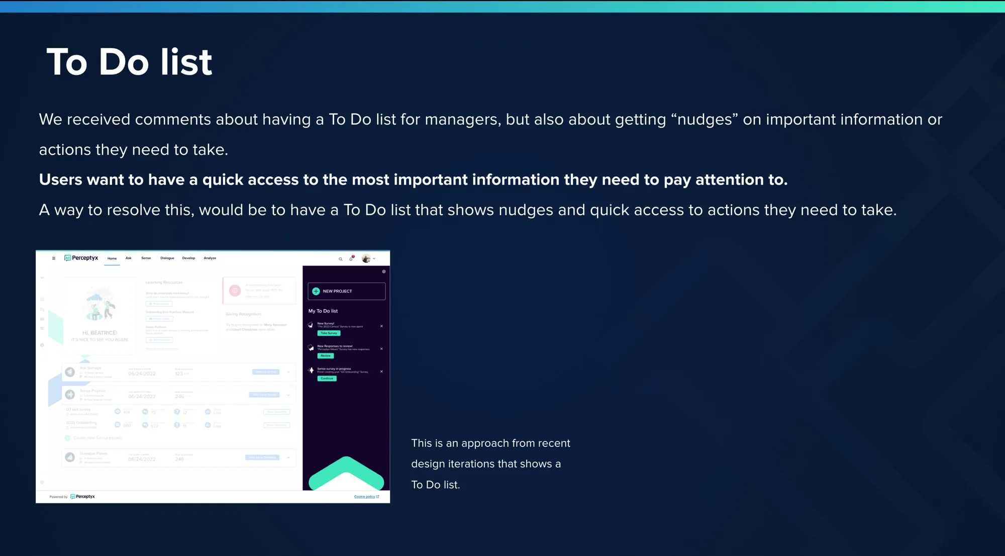
A design iteration of the home dashboard with a To Do list panel surfacing nudges and actions that need attention.
FIG. 4 A design response to a finding, a To Do list surfacing what needs attention.
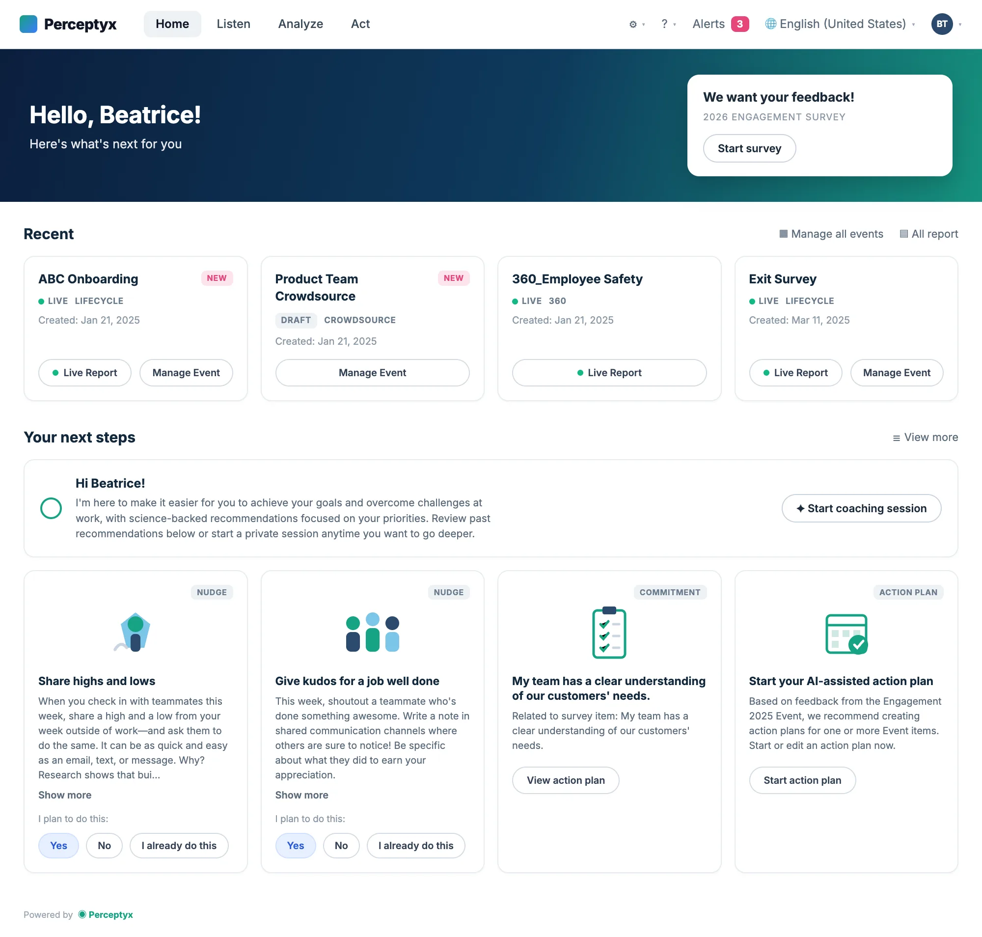
The home dashboard that shipped: recent events, recommended next steps, and quick actions.
FIG. 5 The dashboard that shipped, designed around what users actually told us.

Chapter 06 · From guessing first to asking first

It's easier to get buy-in for research when you can show the work it saves, not just the principle.

What stuck with me is that the fastest way to make the case for research wasn't to defend it as good practice. It was to attach it to something concrete, work saved, rework avoided, that the whole team could see.

It didn't convince everyone, and that's fine. But it moved the default a little: from guessing first to asking first, at least some of the time.

More work
Design System — 4+ products, one system: the Vision colors documentation with accessible tonal ramps Turni — a platform to manage classes and students, shown on desktop and mobile Neto — finance tools for freelancers: the summary screen with net balance per currency