Back to all work
Case study · 03

Turni, booking without the back-and-forth.

Independent trainers run their whole schedule over WhatsApp. Turni is a scheduling and payments tool I designed to make that simple, one product for the trainer and the student. I did the brand, the design system, and the UI, and built realistic prototypes in Figma Make that a developer turned into the React build.

Client
Private
Role
Product & Brand Designer
Type
Product · Brand · Prototyping
End to end
Brand, design system, and UI, designed and prototyped end to end, then built in React by a developer.
Two sides
One product for two users: trainers managing their agenda, and students booking classes.
Trainers wanted in
I tested it with working trainers across disciplines. Some asked how they could start paying for it, before it had even launched.

Chapter 01 · A schedule run over WhatsApp

Trainers across gyms, tennis, and more were running their whole schedule through back-and-forth WhatsApp messages.

Turni started from talking to a lot of independent instructors, gym trainers, tennis coaches, all kinds. They were juggling the same things: scheduling clients over endless WhatsApp threads, sending reminders by hand, and keeping track of payments on the side. Coordinating a single time slot could take a dozen messages.

There are tools for this, but most felt built for features rather than for the person using them, with little thought given to the actual experience. And few fit the Argentine market well, where there's real room for something simple.

Chapter 02 · The real cost is time

For an independent trainer, every hour spent coordinating is an hour not training, and not earning.

The core pain wasn't a missing feature. It was time. Independent instructors run their own admin, and the back-and-forth eats into the hours they could be teaching. The basics they actually needed were simple: reminders over WhatsApp, and a clear handle on payments.

So the goal for Turni was narrow on purpose: cover those basics really well, and make the experience feel calm and obvious instead of piling on options.

Chapter 03 · One product, two sides

A product both the trainer and the student could use without a manual.

Turni is one product with two sides. Trainers get a dashboard to manage their agenda, their students, and their class packs. Students sign up, either to recurring packs or class by class, depending on how each trainer works.

The idea was to keep both sides light. The trainer shouldn't need training to run it, and the student should be able to book in a few taps.
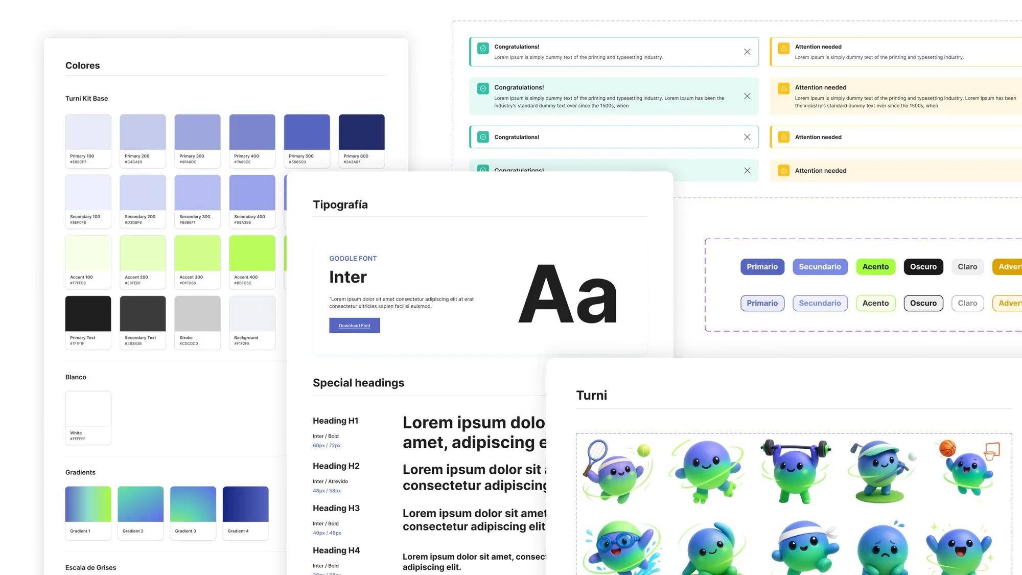
Turni design system, colors, typography, buttons, alerts, and the brand mascot.
FIG. 1 The brand and design system that hold both sides together.
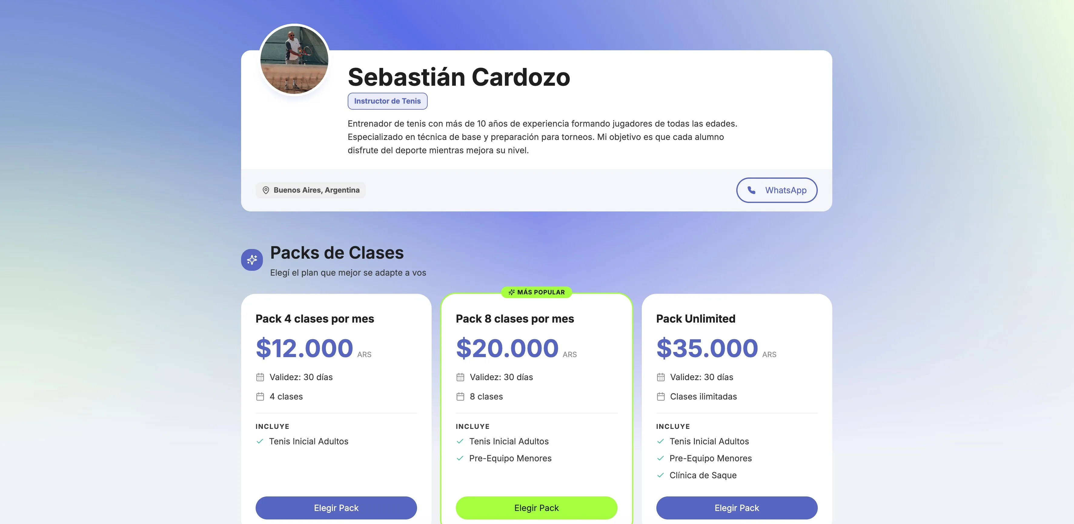
Turni's public page: a trainer's profile and class packs, where students subscribe.
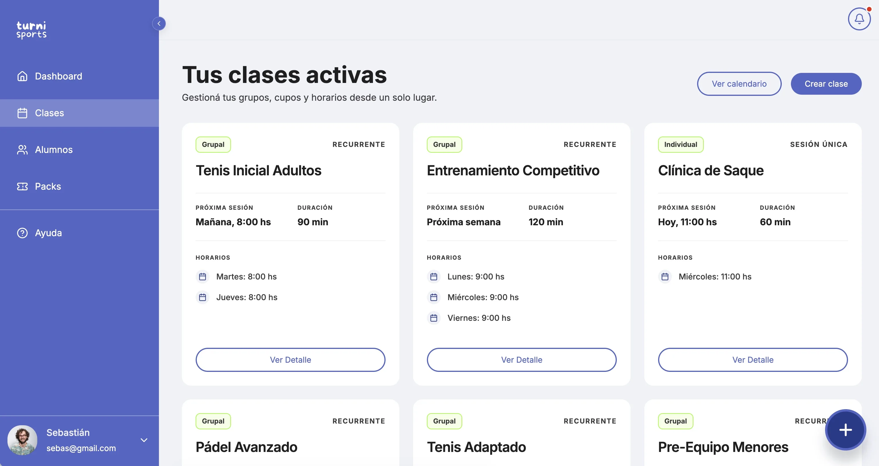
Turni's trainer dashboard: active classes with schedules, duration and details.
FIG. 2 One product, two sides, the student's subscription page and the trainer's dashboard.
Chapter 04 · Brand, system, and a build-ready prototype

I designed the brand, the design system, and the UI, and prototyped it in Figma Make for a developer to build.

I worked on the whole thing end to end: the brand and visual identity, a small design system to keep it consistent, and the full UI for both the trainer and the student sides. Instead of writing the code myself, I built realistic prototypes in Figma Make and handed them to a developer, who built it in React. That's where my frontend background paid off, I could prototype interactions that felt real and hand off something a developer could build straight from.

Keeping a design system even on a small product meant the two sides felt like one thing, and changes stayed cheap to make.

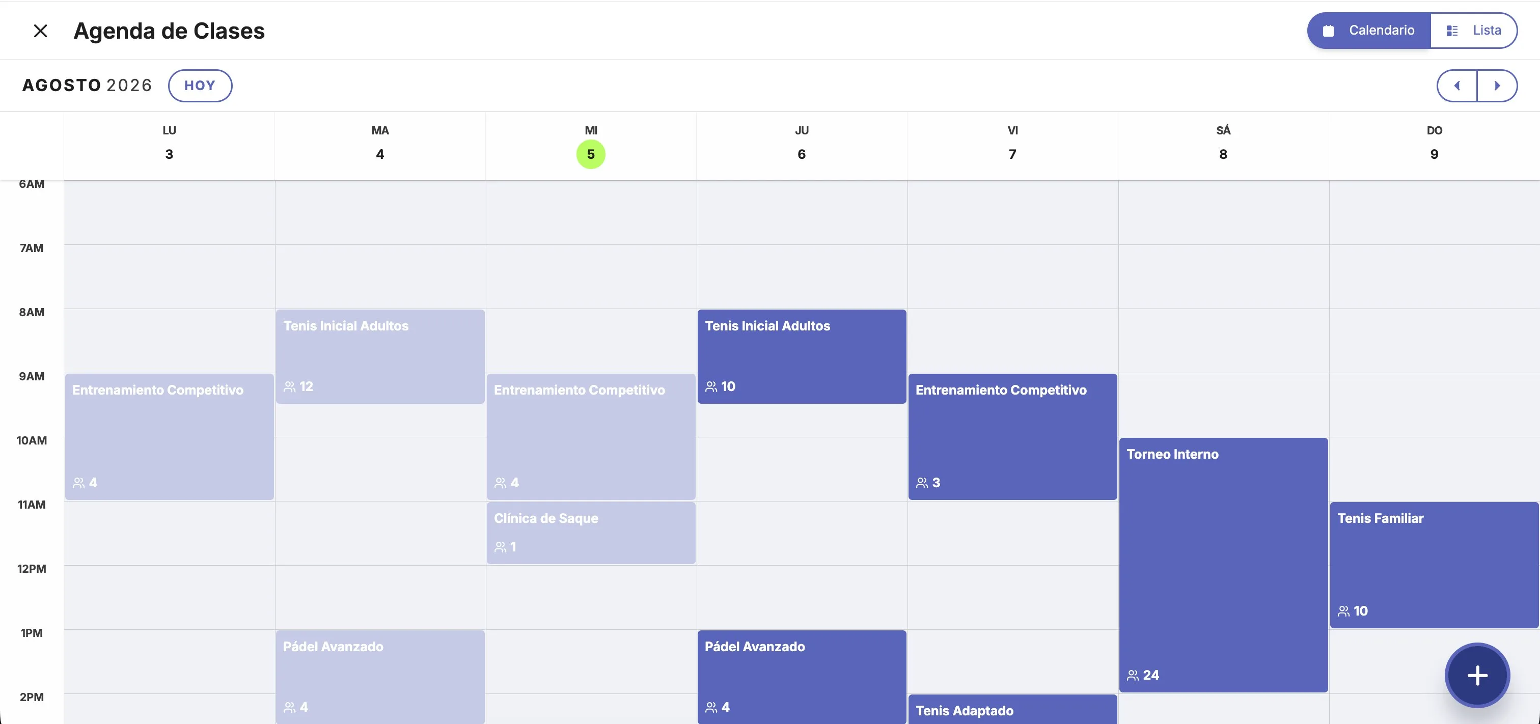
Turni's weekly agenda calendar for the trainer, with classes across the week.
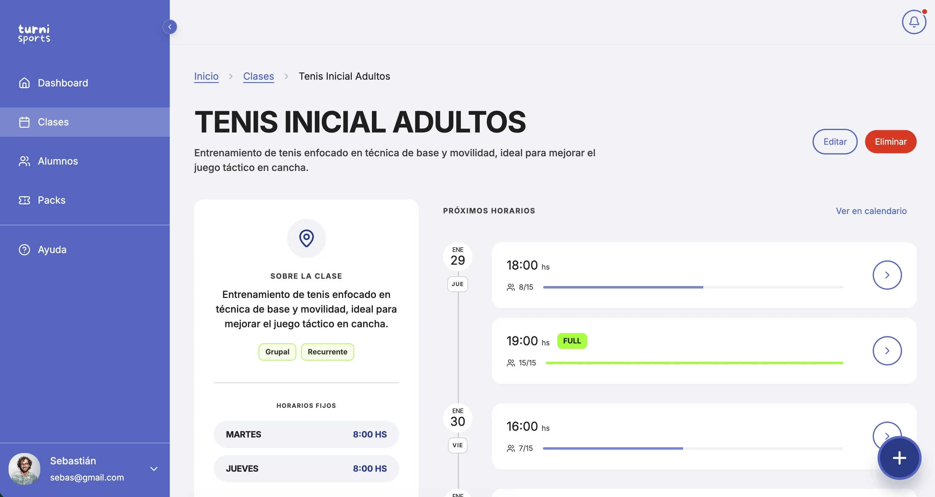
A class detail view: schedule, upcoming slots and capacity.
FIG. 3 The trainer side, the agenda calendar and a class's detail view.
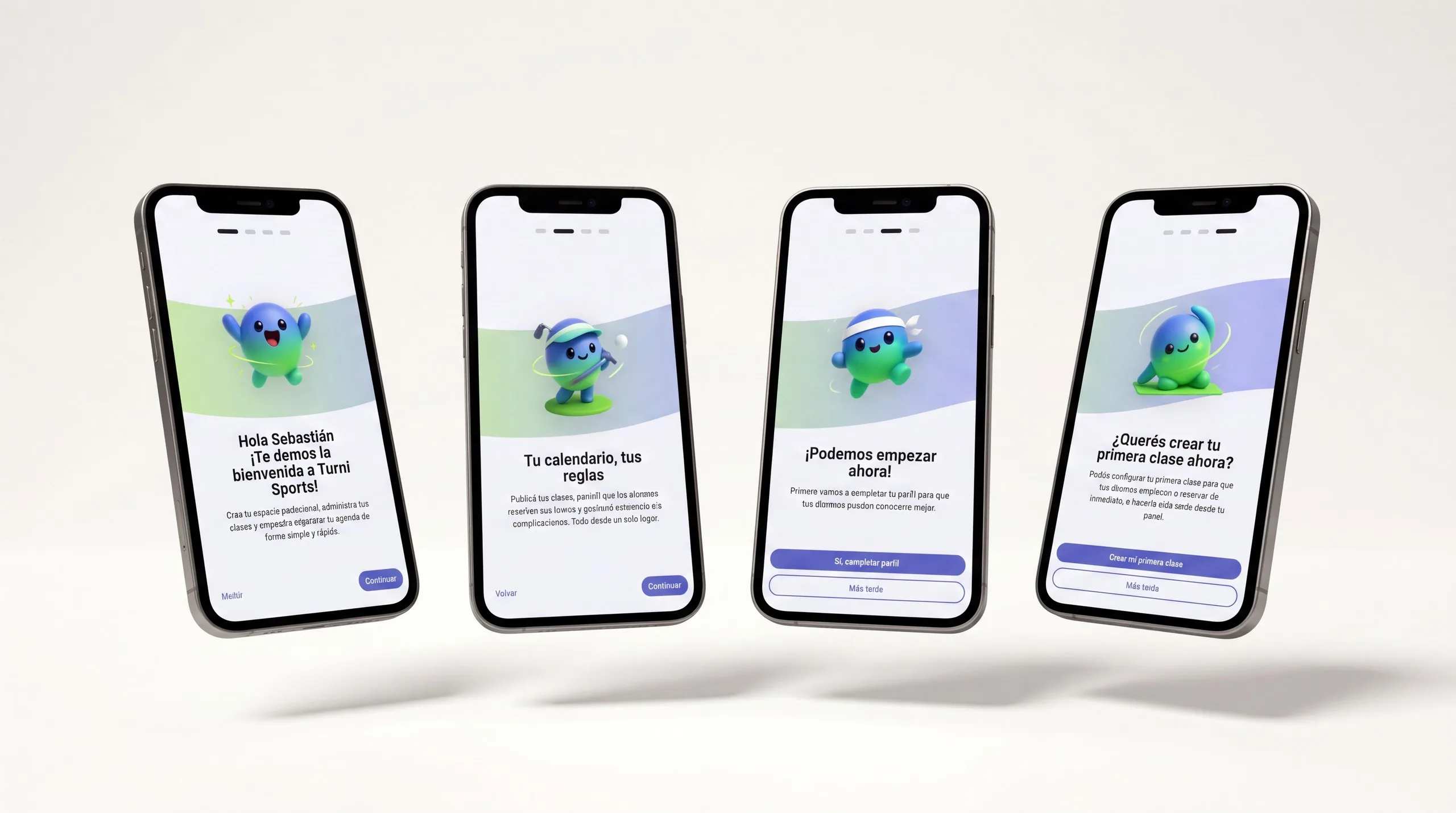
Turni on four phones, showing the trainer's onboarding flow: welcome, calendar, and creating a first class.
FIG. 4 The trainer's onboarding on mobile, setting up their space and first class.

Chapter 05 · Trainers wanted to use it

More than one trainer asked to start using it before it had even launched.

I tested Turni with real trainers across different disciplines and watched them move through it. The response was strong: more than one asked when they could start using it for real. For a product built by one designer and one developer, that told me we had read the problem right.

Chapter 06 · Where design and code come together

Turni is the clearest example of what my mix of design and code lets me do.

Turni is the project where my background comes together most clearly. I framed the problem from real conversations, designed the brand and the system, and created the screens end to end.

It also taught me to keep scope honest. The product worked because it did a few important things well, not because it tried to do everything.

Turni didn't reach the market in the end. It stayed a validated prototype, but it's still the project that shows most clearly how I work: from a problem, through brand and system, to something real enough to put in front of people.

More work
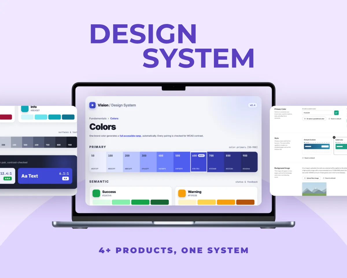
Design System — 4+ products, one system: the Vision colors documentation with accessible tonal ramps UX Research — from guesses to evidence: personas, the home dashboard and a to-do list that shipped Neto — finance tools for freelancers: the summary screen with net balance per currency